Redesigning Reading Quantified
Introduction
A couple weeks ago, I released the latest version of Reading Quantified. The biggest difference is how my reading habits are visualized: before, it was primarily focused on monthly trends and now, it's focused on annual trends.
The change
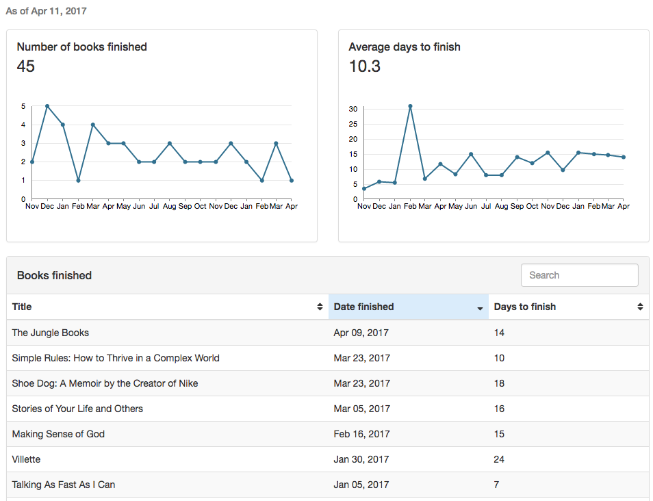
Here's a snapshot of what it looked like before:
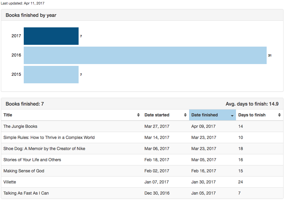
And here's a snapshot of what it looks like now:
Why the redesign?
The primary reason for this change is my desire to see progress over a longer period of time. Now that I've been analyzing my reading habits for over a year, seeing monthly breakdowns isn't as meaningful for me. I'm much more interested in understanding how many books I've read over the course of a year. As a result, I decided to use a horizontal bar chart to make it easy to compare by year. The bar chart is also interactive: when I click on a bar, the table is filtered for the specified year, so I can see details of the books I've read and how long it took me.
What's next
As I mentioned in my first post on Reading Quantified, this is an active project for me, so as my needs change, the site will change! Please continue to check back and see how it evolves!